The Ultimate Guide to the Premier League Logo: History Design and Evolution
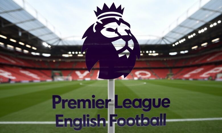
The Premier League logo is one of the most recognizable symbols in global sports, representing England’s top-tier football competition and its rich legacy of drama, talent, and passion. For fans searching Premier League logo, the interest often spans its design evolution, historical significance, and branding impact. This explores the logo’s journey, from its inception in 1992 to its modern iterations, offering insights into its design principles, cultural importance, and tips for fans.this article leverages data from trusted sources like the Premier League’s official website, design analyses.
Table of Contents
What Is the Premier League Logo
The Premier League logo is the official emblem of the English Premier League (EPL), the world’s most-watched football league, contested by 20 clubs. Introduced in 1992 when the league broke away from the Football League, the logo encapsulates the competition’s identity, blending tradition with modernity. Featuring a crowned lion a nod to English heritage the logo has evolved to reflect changing design trends and the league’s global appeal. Fans searching for the logo often seek its history, downloadable versions, or insights into its redesigns.
This guide covers the logo’s origins, design iterations, and cultural significance, drawing from sources like Design Week, Logo Geek, and X posts to provide a holistic view.
The History of the Premier League Logo
1992–2001: The Original Logo
When the FA Premier League was founded on February 20, 1992, its first logo debuted with a bold, regal design. . The word Premier League was written in serif font below the image of a lion sporting a crown and standing atop a football. The crest of the Three Lions of England national team served as inspiration for the lion, a symbol of English pride and strength. The blue and red color scheme reflected tradition, while the serif typography conveyed authority.
This logo, used during the FA Carling Premiership era (1993–2001), was iconic during the league’s formative years, when Manchester United dominated and stars like Alan Shearer shone. According to Logo Geek, early sketches showed multiple lion poses, with the final design chosen for its balance of power and elegance.
2001–2007: The Barclaycard Era
In 2001, with Barclaycard’s sponsorship, the logo was updated to align with the FA Barclaycard Premiership branding. The lion remained central, but the design became more dynamic, with a sleeker, forward-leaning lion and a modernized font. The color palette shifted to deeper blues and reds, and the football was simplified. This version, used until 2004 (later FA Barclays Premiership), reflected the league’s growing commercial success, as noted in a Design Week analysis of its branding evolution.
2007–2016: Streamlined Sophistication
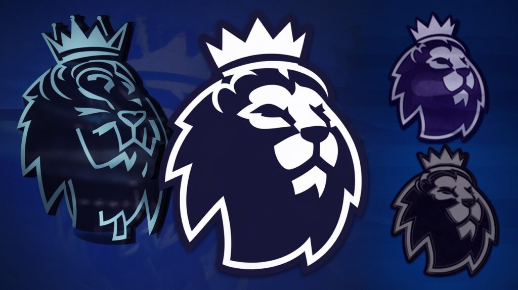
The 2007 redesign, coinciding with the end of Barclays’ title sponsorship in 2016, introduced a cleaner look. The lion was redrawn with sharper lines, and the typography shifted to a semi-serif font for a contemporary feel. With versions for both light and dark backgrounds, the logo gained more adaptability. This era saw the Premier League’s global reach expand, with broadcasts in over 200 countries. The design’s adaptability was key, as highlighted by branding experts on 99designs.com, who praised its balance of tradition and modernity.
2016–Present: The Modern Minimalist Logo
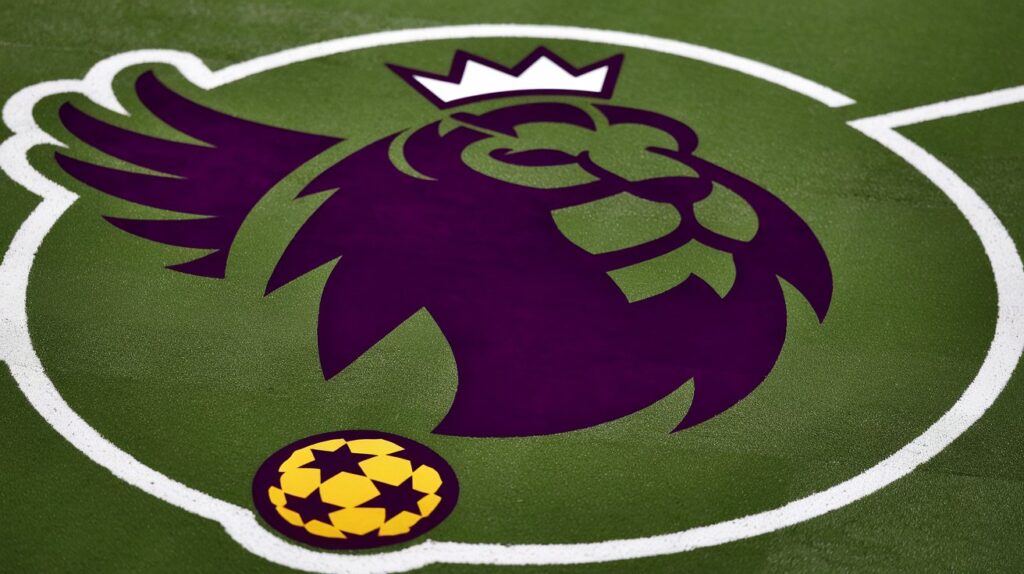
In 2016, the Premier League unveiled a groundbreaking redesign, moving away from sponsorship branding to a “clean” identity, as announced on June 4, 2015. Designed by DesignStudio, the new logo stripped away the football and simplified the lion into a stylized, crownless head. The sans-serif font, paired with a vibrant purple-and-red gradient, gave it a digital-friendly, modern aesthetic. According to @culturaltutor on X, this shift to a text-centered, sans-serif design with a minimalist lion symbol aligned with global sports branding trends.
The 2016 logo’s flexibility available in monochrome, gradient, and animated formats—made it ideal for digital platforms, merchandise, and stadium displays. It debuted in the 2016–17 season, when Leicester City’s miracle title was still fresh, and remains in use for the 2024–25 season, where Liverpool lead the standings.
Design Principles Behind the Premier League Logo
The Premier League logo’s success lies in its adherence to key design principles:
- Simplicity: The 2016 redesign’s minimalist lion and clean typography ensure instant recognition, even at small sizes.
- Versatility: Multiple color variants (purple, red, black, white) and formats (static, animated) suit diverse applications, from TV graphics to jerseys.
- Symbolism: The lion, rooted in English heraldry, evokes strength and pride, while the crown (pre-2016) tied to royalty.
- Modernity: The sans-serif font and gradient colors reflect contemporary design trends, as noted by Logo Geek’s analysis of its development.
- Consistency: Despite changes, the lion has remained a constant, preserving brand equity.
DesignStudio’s 2016 brief emphasized a logo that could compete with major U.S. sports leagues like the NFL, which influenced its clean, sponsor-free approach.
Evolution and Cultural Significance
The Premier League logos evolution mirrors the league’s growth from a domestic competition to a global phenomenon. The 1992 logo captured the league’s ambition during its breakaway from the Football League, while the 2016 redesign reflected its status as a $5 billion industry, per Deloitte’s 2024 football finance report. The logo appears on everything from player kits to Fantasy Premier League apps, uniting fans across 900 million households worldwide.
Culturally, the logo is a symbol of moments like Manchester United’s 1999 treble, Arsenal’s 2003–04 Invincibles, and Leicester’s 2015–16 miracle. It’s also a marketing powerhouse, with Nike as the official ball supplier and Topps producing collectibles like Match Attax cards since 2007. Posts on X, like @classicshirts’ thread on European league logos, highlight its iconic status alongside LaLiga and Serie A.
The Season and the Logos Presence
In the season, the Premier League logo is omnipresent as Liverpool chase the title, with Arsenal, Manchester City, and Aston Villa in contention. It appears on broadcasts (NBC, DAZN, Disney+), stadium hoardings, and official merchandise. The logo’s animated version, used in match intros, enhances its digital appeal, as seen in ESPN’s coverage of Matchweek 33, where Brentford’s 4–2 win over Brighton was highlighted. Fans can download high-resolution versions from premierleague.com or find vector files on platforms like BrandEPS.com for personal use.
How to Access and Use the Premier League Logo
For fans and designers, accessing the Premier League logo is easy but comes with guidelines:
- Official Source: Premierleague.com offers PNG and JPG versions under media resources, requiring permission for commercial use.
- Free Platforms: Websites like SeekLogo.com provide vector files (SVG, EPS) for non-commercial projects.
- Design Tools: Canva and Adobe Express offer templates with the logo for fan art or social media graphics.
- Usage Rules: The Premier League prohibits unauthorized commercial use, as stated in its branding guidelines, to protect intellectual property.
Always verify usage rights to avoid copyright issues, especially for merchandise or public displays.
Why the Premier League Logo Resonates with Fans
The logo’s appeal lies in its ability to evoke emotion and identity. It is a badge of loyalty for fans, whether they are rooting for the 13 titles Manchester United has won or for the underdogs like Burnley, who were promoted in 2024. Its presence on kits, worn by stars like Erling Haaland and Mohamed Salah, ties it to unforgettable moments, like Trent Alexander-Arnold’s title-clinching goal against Leicester. The logo’s global reach, amplified by social media and streaming, makes it a unifying symbol for diverse fanbases, from Accra to Buenos Aires.
How to Keep Up with Premier League Branding
- Visit Premierleague.com: Check the media section for logo updates and branding news.
- Follow Design Blogs: Sites like Logo Geek and Design Week analyze logo redesigns and trends.
- Engage on X: Accounts like @logogeek and @culturaltutor share insights on logo evolution.
- Explore Fan Communities: Reddit’s r/PremierLeague discusses logo usage in fan art and merchandise.
- Monitor Sponsorships: New partners, like Nike, influence logo applications on official gear.
Challenges and Future Outlook
The Premier League logo faces challenges like maintaining relevance in a digital age and avoiding over-commercialization. The 2016 redesign’s sponsor-free approach was a bold move, but future iterations may need to balance minimalism with bolder elements to stand out against rivals like LaLiga’s vibrant logo. Fan feedback on X suggests a desire for a return to the crowned lion for added tradition. As the league eyes markets like Asia and Africa, the logo’s adaptability will be key.
Conclusion
The passion, history, and ambition of England’s premier football league are embodied in the Premier League logo, which is more than just a symbol. It is a global icon. From its regal 1992 debut to the sleek 2016 redesign, the logo has evolved with the times, balancing tradition with modernity. Whether you’re a fan seeking its history, a designer analyzing its principles, or a marketer studying its impact, this guide offers everything you need to understand the Premier League logo. Bookmark this page, explore premierleague.com, and join the millions celebrating the logo’s role in football’s greatest moments. As the season unfolds, the lion continues to roar, uniting fans worldwide.
FAQS
1. What does the current Premier League logo look like in 2024-25?
The 2016 logo, still in use, features a stylized lion head in purple and red gradients with sans-serif “Premier League” text, seen on kits and broadcasts like Liverpool’s 1-0 win over Leicester.
2. Where can I download the Premier League logo for free?
High-resolution PNG and JPG versions are available on premierleague.com under media resources. SeekLogo.com offers vector files for non-commercial use.
3. Why did the Premier League logo change in 2016?
The 2016 redesign by DesignStudio removed the crown and football for a minimalist, sponsor-free look, aligning with digital trends and global branding, as noted by @culturaltutor on X
4. How is the Premier League logo used in the 2024-25 season?
It appears on player kits, stadium displays, and broadcasts on NBC, DAZN, and Disney+. Animated versions enhance match intros, like Arsenal’s 4-0 win over Ipswich.
5. What inspired the lion in the Premier League logo?
The lion, symbolizing English strength and pride, draws from the Three Lions of England’s national crest, a nod to heritage since the 1992 logo, per Logo Geek.


